


UI/UX Design Guide 2026 | Complete User Interface & User Experience Guide

Introduction to UI/UX Design: Everything You Need to Know About User Interface & User Experience Design
The success of any website, mobile application, or digital product depends not only on its functionality but also on how users interact with it. A visually attractive interface combined with a seamless user experience helps businesses build trust, improve customer satisfaction, increase engagement, and achieve higher conversion rates. This is where UI/UX Design plays a vital role.
From simple landing pages to enterprise software, every digital product benefits from thoughtful UI/UX Design. Organizations invest heavily in user-centered design because it creates intuitive experiences that make products easier to use while supporting business goals.
In this chapter, you’ll learn the fundamentals of UI/UX Design, understand the differences between User Interface (UI) and User Experience (UX), explore their evolution, discover core principles, and learn why UI/UX Design has become one of the most valuable skills in the digital industry.
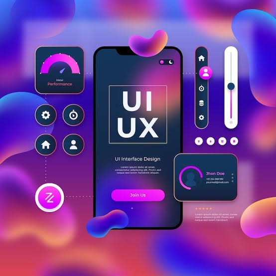
What is UI/UX Design?


7
UI/UX Design is the process of designing digital products that are visually appealing, easy to use, accessible, and focused on meeting users’ needs.
While often mentioned together, UI and UX serve different purposes:
- User Interface (UI): Focuses on the visual appearance of a digital product, including colors, typography, buttons, icons, layouts, and interactive elements.
- User Experience (UX): Focuses on the overall experience users have while interacting with a product, ensuring it is intuitive, efficient, enjoyable, and easy to navigate.
Together, UI/UX Design creates products that balance aesthetics with usability.
Why UI/UX Design Matters


6
Excellent UI/UX Design directly influences how users perceive and interact with digital products.
Benefits
- Improves user satisfaction
- Increases customer engagement
- Builds brand credibility
- Reduces user frustration
- Improves accessibility
- Increases conversion rates
- Encourages customer loyalty
- Reduces development costs through early testing
- Supports long-term business growth
Companies that prioritize UI/UX Design often experience better customer retention and stronger competitive advantages.
Difference Between UI and UX


6
Although UI and UX work together, they focus on different aspects of product design.
| User Interface (UI) | User Experience (UX) |
|---|---|
| Visual appearance | Overall user journey |
| Colors and typography | User research |
| Buttons and icons | Information architecture |
| Layout and spacing | Wireframing |
| Visual consistency | Usability testing |
| Interactive elements | User satisfaction |
A beautiful interface cannot compensate for poor usability, and an excellent experience can be weakened by a confusing visual design. Successful UI/UX Design combines both disciplines.
History of UI/UX Design


7
The concept of UI/UX Design has evolved alongside computing technology.
Early Interfaces
Early computers relied on command-line interfaces that required users to type commands manually.
Graphical User Interfaces (GUI)
The introduction of graphical interfaces with windows, icons, and menus made computers easier to use.
Web Design Era
As the internet expanded, websites became more visually appealing and interactive, increasing the importance of usability.
Mobile Revolution
Smartphones shifted design priorities toward touch-friendly interfaces, responsive layouts, and simplified navigation.
Modern Experience Design
Today’s UI/UX Design focuses on user-centered experiences across websites, mobile apps, wearables, and emerging technologies.
Evolution of UI/UX Design


8
Digital experiences continue to evolve rapidly.
Major milestones include:
- Desktop-first websites
- Responsive web design
- Mobile-first development
- Flat design
- Material Design
- Dark mode interfaces
- Voice user interfaces
- AI-assisted design
- Personalized user experiences
Modern UI/UX Design adapts to changing user expectations and new technologies.
Design Thinking


7
Design Thinking is a problem-solving methodology that places users at the center of the design process.
Five Stages
- Empathize
- Define
- Ideate
- Prototype
- Test
Using Design Thinking helps teams create more effective and user-friendly UI/UX Design solutions.
User-Centered Design (UCD)


7
User-Centered Design focuses on understanding users before creating digital products.
Key Principles
- Understand user needs
- Research target audiences
- Test designs early
- Gather feedback continuously
- Improve designs iteratively
This approach helps ensure that UI/UX Design solves real user problems rather than assumptions.
Core Principles of UI/UX Design


7
Successful UI/UX Design follows several fundamental principles.
Simplicity
Keep interfaces clean and easy to understand.
Consistency
Use consistent colors, typography, icons, and interactions throughout the product.
Accessibility
Design products that are usable by people with diverse abilities and assistive technologies.
Visual Hierarchy
Guide users’ attention using size, spacing, color, and contrast.
Feedback
Provide immediate responses to user actions, such as confirmation messages or loading indicators.
Learnability
New users should quickly understand how to use the product.
Efficiency
Allow experienced users to complete tasks quickly with minimal effort.
Components of UI/UX Design


7
A modern UI/UX Design includes many interconnected components.
User Interface Components
- Buttons
- Navigation menus
- Forms
- Icons
- Cards
- Dialog boxes
- Typography
- Images
- Animations
User Experience Components
- User research
- Personas
- User journeys
- Information architecture
- Wireframes
- Prototypes
- Usability testing
Together, these components create a cohesive digital experience.
Benefits of UI/UX Design


8
Investing in UI/UX Design provides significant advantages.
Business Benefits
- Higher customer satisfaction
- Increased conversions
- Better user retention
- Stronger brand identity
- Reduced support costs
- Improved SEO through better usability
- Faster product adoption
- Competitive advantage
Challenges in UI/UX Design


7
Designing outstanding user experiences comes with challenges.
Common issues include:
- Understanding diverse user needs
- Balancing creativity and usability
- Maintaining consistency
- Supporting multiple devices
- Accessibility compliance
- Performance optimization
- Managing stakeholder expectations
- Keeping up with design trends
Overcoming these challenges requires research, collaboration, and continuous improvement.
UI/UX Design Process Overview


6
A typical UI/UX Design process includes:
- User Research
- Competitor Analysis
- Define Requirements
- Create User Personas
- Build Information Architecture
- Design Wireframes
- Create Interactive Prototypes
- Conduct Usability Testing
- Refine the Design
- Developer Handoff
- Post-launch Evaluation
This structured process helps teams deliver user-focused digital products.
Best Practices for UI/UX Design


6
To create effective UI/UX Design:
- Understand your target audience.
- Keep interfaces simple and intuitive.
- Maintain consistent visual elements.
- Prioritize accessibility.
- Test with real users.
- Optimize for mobile devices.
- Use clear navigation.
- Continuously gather feedback.
- Iterate based on data and user behavior.
- Collaborate closely with developers.
Common Mistakes
- Designing without user research.
- Overcomplicating interfaces.
- Ignoring accessibility standards.
- Using inconsistent layouts.
- Prioritizing appearance over usability.
- Skipping usability testing.
- Neglecting mobile responsiveness.
- Failing to collect post-launch feedback.
UI vs UX Comparison
| Feature | UI Design | UX Design |
|---|---|---|
| Focus | Visual appearance | User experience |
| Goal | Attractive interface | Easy and efficient interaction |
| Main Elements | Colors, typography, icons | Research, testing, user journeys |
| Success Metric | Visual consistency | User satisfaction |
| Deliverables | High-fidelity designs | Wireframes, prototypes, research |
Key Takeaways
UI/UX Design combines visual design with user-centered thinking to create digital products that are both attractive and easy to use. By understanding user needs, applying design principles, and following a structured design process, organizations can improve customer satisfaction, strengthen brand trust, and achieve better business results. Whether designing websites, mobile applications, or enterprise software, investing in UI/UX Design is essential for delivering exceptional digital experiences.
UI Design Fundamentals: Building Beautiful, Functional & User-Friendly Interfaces
A well-designed interface is the foundation of every successful website, mobile application, and digital product. While User Experience (UX) focuses on the overall journey, UI Design is responsible for creating visually appealing, intuitive, and interactive interfaces that users enjoy using. Effective UI/UX Design combines creativity with usability to ensure that every element contributes to a seamless experience.
In this chapter, you’ll learn the essential principles of UI/UX Design related to User Interface (UI), including color theory, typography, layouts, visual hierarchy, responsive design, and modern interface components. Mastering these fundamentals will help you create professional designs that look great and perform exceptionally across devices.
Visual Design Principles


6
Visual design principles are the foundation of UI/UX Design, helping designers create interfaces that are attractive, consistent, and easy to understand.
Balance
Distribute visual elements evenly to create a harmonious interface. Balance can be symmetrical or asymmetrical, depending on the desired aesthetic.
Contrast
Use differences in color, size, typography, and spacing to highlight important content and guide users’ attention.
Alignment
Align elements consistently to create a clean and organized layout that improves readability.
Repetition
Reuse design elements such as colors, fonts, icons, and button styles to maintain consistency throughout the interface.
Proximity
Group related elements together so users can easily understand relationships between content.
White Space
Leave sufficient spacing around elements to improve readability and reduce visual clutter.
Applying these principles consistently leads to a more effective UI/UX Design.
Color Theory in UI Design


6
Color plays a crucial role in UI/UX Design by influencing emotions, brand perception, and user behavior.
Primary Colors
Represent the main brand identity and are used for prominent interface elements.
Secondary Colors
Support the primary palette and add variety while maintaining consistency.
Accent Colors
Highlight calls-to-action, notifications, or important interactive elements.
Neutral Colors
Used for backgrounds, text, borders, and supporting content to create balance.
Psychological Impact of Colors
| Color | Common Associations |
|---|---|
| Blue | Trust, professionalism, reliability |
| Green | Growth, success, nature |
| Red | Urgency, excitement, action |
| Yellow | Optimism, attention |
| Purple | Creativity, luxury |
| Black | Elegance, sophistication |
| White | Simplicity, cleanliness |
Choose colors with accessibility and contrast in mind to ensure readability for all users.
Typography


7
Typography is more than selecting attractive fonts—it enhances readability and communication.
Font Categories
- Serif
- Sans-serif
- Monospace
- Display
- Script
Typography Best Practices
- Limit the number of font families.
- Use clear font hierarchies.
- Maintain consistent line spacing.
- Ensure readable font sizes.
- Optimize typography for different screen sizes.
A strong typographic system improves both aesthetics and usability.
Icons & Illustrations


4
Icons simplify navigation by representing actions and concepts visually.
Benefits
- Faster recognition
- Reduced text clutter
- Improved navigation
- Better accessibility when paired with labels
- Stronger visual appeal
Illustrations can add personality, explain complex concepts, and create engaging onboarding experiences.
Buttons & Call-to-Action (CTA)


6
Buttons are one of the most important interactive components in UI/UX Design.
Common Button Types
- Primary
- Secondary
- Outline
- Text
- Floating Action Button (FAB)
- Icon Button
Button States
- Default
- Hover
- Focus
- Active
- Disabled
- Loading
Buttons should be large enough for touch interaction, visually distinct, and clearly labeled.
Layout & Grid Systems


6
Grid systems provide structure and consistency across digital interfaces.
Popular Layouts
- 12-column grid
- Card-based layouts
- Masonry layouts
- Split-screen layouts
- Single-column layouts
- Dashboard layouts
Grids help align content, improve responsiveness, and create visually balanced pages.
White Space


6
White space, also known as negative space, refers to the empty areas around design elements.
Benefits
- Improves readability
- Enhances focus
- Creates visual balance
- Makes interfaces feel modern and uncluttered
- Improves user comprehension
Effective use of white space is a hallmark of high-quality UI/UX Design.
Visual Hierarchy


6
Visual hierarchy determines the order in which users notice information.
Methods to Create Hierarchy
- Larger headings
- Bold typography
- Contrasting colors
- Strategic spacing
- Images
- Icons
- Positioning
- Motion and animations
A clear hierarchy helps users find important information quickly.
Responsive Design


5
Responsive design ensures that websites and applications adapt seamlessly to different screen sizes.
Key Principles
- Flexible grids
- Responsive images
- Fluid layouts
- Media queries
- Scalable typography
- Touch-friendly controls
Responsive design is essential for delivering consistent experiences across desktops, tablets, and smartphones.
Mobile-First Design


6
With mobile traffic dominating the web, designing for smaller screens first has become a best practice.
Advantages
- Improved performance
- Simplified interfaces
- Better accessibility
- Faster loading times
- Easier scalability for larger screens
A mobile-first approach encourages designers to focus on the most important content and interactions.
UI Components


6
Reusable components help maintain consistency and speed up development.
Common Components
- Navigation bars
- Buttons
- Cards
- Forms
- Input fields
- Checkboxes
- Radio buttons
- Dropdown menus
- Tables
- Tabs
- Modals
- Tooltips
- Accordions
- Progress indicators
- Toast notifications
Using a design system ensures these components behave consistently across projects.
Design Consistency


6
Consistency improves usability by making interfaces predictable and familiar.
Maintain Consistency Through
- Standardized colors
- Typography rules
- Icon libraries
- Button styles
- Spacing systems
- Layout guidelines
- Interaction patterns
- Brand identity
Users learn interfaces faster when visual and functional patterns remain consistent.
UI Design Trends


7
Current trends influencing UI/UX Design include:
- Minimalism
- Glassmorphism
- Dark Mode
- Soft Shadows
- Microinteractions
- Bold Typography
- AI-Assisted Interfaces
- Custom Illustrations
- 3D Elements
- Personalized Experiences
While trends can enhance aesthetics, they should always support usability rather than distract from it.
Best Practices for UI Design
- Prioritize clarity over decoration.
- Design with accessibility in mind.
- Use consistent spacing and alignment.
- Optimize interfaces for all screen sizes.
- Provide clear feedback for user actions.
- Use high-contrast text for readability.
- Minimize unnecessary elements.
- Test interfaces with real users.
- Maintain a scalable design system.
- Continuously refine based on user feedback.
Common UI Design Mistakes
- Overusing colors and animations.
- Inconsistent button styles.
- Poor typography choices.
- Ignoring accessibility standards.
- Cluttered layouts.
- Weak visual hierarchy.
- Tiny touch targets on mobile.
- Confusing navigation.
- Low color contrast.
- Designing only for desktop users.
UI Design Elements Comparison
| Element | Purpose | Best Practice |
|---|---|---|
| Color | Branding & emphasis | Maintain accessible contrast |
| Typography | Readability | Use a clear hierarchy |
| Buttons | User actions | Keep labels concise and visible |
| Icons | Visual communication | Pair with text when needed |
| Grid | Layout structure | Use consistent alignment |
| White Space | Improve clarity | Avoid overcrowding |
| Navigation | User movement | Keep menus simple |
| Forms | Data collection | Minimize required fields |
UX Design Process: Research, Strategy & Creating Exceptional User Experiences
User Experience (UX) Design is much more than making a website or application look attractive. It focuses on understanding users, solving their problems, and designing digital products that are intuitive, efficient, and enjoyable. A structured UI/UX Design process ensures every design decision is backed by research, user feedback, and business objectives.
In this chapter, you’ll explore the complete UX design workflow—from understanding your users through research to creating wireframes, prototypes, and conducting usability testing. Mastering this process helps designers build products that deliver meaningful experiences while achieving business goals.
What is UX Design?


6
User Experience (UX) Design is the practice of designing products that are useful, usable, accessible, and enjoyable. Unlike User Interface (UI), which focuses on visual appearance, UX focuses on how users interact with a product and how effectively it solves their problems.
The primary goals of UX design are to:
- Understand user needs
- Eliminate friction
- Improve usability
- Increase user satisfaction
- Support business objectives
- Create seamless digital experiences
An effective UX strategy is a core part of successful UI/UX Design.
UX Design Process Overview


6
Although workflows vary between organizations, a typical UX design process includes:
- User Research
- Competitor Analysis
- Define User Problems
- Create User Personas
- Build Information Architecture
- Design User Flows
- Create Wireframes
- Develop Interactive Prototypes
- Conduct Usability Testing
- Iterate Based on Feedback
- Developer Handoff
- Monitor After Launch
This iterative approach ensures products continue improving over time.
User Research


6
User research is the foundation of every successful UX project. It helps designers understand user behaviors, motivations, challenges, and expectations.
Research Methods
- User Interviews
- Surveys
- Questionnaires
- Focus Groups
- Contextual Inquiry
- Field Studies
- Analytics Review
- Customer Support Analysis
- Observation
- Heatmaps
Benefits
- Reduces assumptions
- Identifies real user needs
- Improves decision-making
- Increases product success
Competitor Analysis


6
Analyzing competitors helps identify industry standards, design opportunities, and areas for innovation.
Evaluate competitors based on:
- Navigation
- Layout
- Visual design
- Features
- Performance
- Accessibility
- Mobile responsiveness
- User reviews
- Conversion strategies
Competitor analysis helps strengthen UI/UX Design decisions by learning from existing products.
User Personas


6
User personas are fictional representations of your target audience based on real research.
A persona typically includes:
- Name
- Age
- Occupation
- Goals
- Pain Points
- Behaviors
- Devices Used
- Technical Skill Level
- Preferred Communication
Personas help teams make user-focused design decisions throughout the project.
Empathy Maps


6
Empathy maps help designers better understand how users think and feel.
An empathy map is divided into four sections:
- Says
- Thinks
- Does
- Feels
Using empathy maps encourages designers to create experiences that truly address user needs.
User Journey Mapping


6
A user journey map visualizes the steps users take while interacting with a product.
Typical stages include:
- Awareness
- Consideration
- Decision
- Onboarding
- Product Usage
- Support
- Loyalty
Mapping the journey helps identify friction points and opportunities for improvement.
Information Architecture (IA)


6
Information Architecture organizes content so users can easily find what they need.
Core Elements
- Site Maps
- Navigation Menus
- Categories
- Labels
- Search
- Content Hierarchy
A well-structured IA improves usability and supports both user satisfaction and SEO.
User Flows


4
User flows illustrate the path users take to complete a task.
Examples include:
- Account Registration
- Product Purchase
- Booking an Appointment
- Password Reset
- Subscription Process
Simple and logical user flows reduce confusion and improve task completion rates.
Wireframing


6
Wireframes are low-fidelity layouts that define structure before visual design begins.
Types of Wireframes
- Low-Fidelity
- Mid-Fidelity
- High-Fidelity
Wireframing allows designers to validate layouts and functionality before investing time in polished visuals.
Interactive Prototyping


6
Prototypes simulate how a product will function before development.
Benefits
- Validate interactions
- Demonstrate user flows
- Gather stakeholder feedback
- Detect usability issues early
- Reduce development costs
Popular prototyping tools include Figma, Adobe XD, Framer, and ProtoPie.
Usability Testing


6
Usability testing evaluates how real users interact with a product.
Common Testing Methods
- Moderated Testing
- Unmoderated Testing
- Remote Testing
- In-Person Testing
- A/B Testing
- Guerrilla Testing
What to Measure
- Task Completion Rate
- Time on Task
- Error Rate
- User Satisfaction
- Navigation Efficiency
- Conversion Rate
Testing ensures the final product is intuitive and effective.
UX Metrics


6
UX metrics help evaluate product performance after launch.
Important metrics include:
- Customer Satisfaction (CSAT)
- Net Promoter Score (NPS)
- System Usability Scale (SUS)
- Task Success Rate
- Bounce Rate
- Session Duration
- Retention Rate
- Conversion Rate
Tracking these metrics supports continuous improvement.
Collaboration in UX Design


6
Successful UX projects require collaboration between:
- UX Designers
- UI Designers
- Developers
- Product Managers
- Business Analysts
- Marketing Teams
- QA Engineers
- Stakeholders
Clear communication helps align design decisions with technical feasibility and business goals.
UX Documentation


6
Good documentation ensures a smooth transition from design to development.
Common UX documents include:
- Research Reports
- Personas
- Journey Maps
- Wireframes
- Prototypes
- Design Specifications
- User Flows
- Accessibility Guidelines
Comprehensive documentation improves consistency and reduces implementation errors.
Best Practices for UX Design
- Conduct research before designing.
- Validate assumptions with real users.
- Simplify user journeys.
- Prioritize accessibility.
- Test prototypes early and often.
- Use data to guide improvements.
- Collaborate across teams.
- Iterate continuously after launch.
- Focus on solving real user problems.
- Balance user needs with business goals.
Common UX Design Mistakes
- Designing without research.
- Ignoring user feedback.
- Creating overly complex user flows.
- Poor information architecture.
- Skipping usability testing.
- Failing to iterate designs.
- Overlooking accessibility.
- Assuming all users behave the same.
- Prioritizing features over usability.
- Neglecting post-launch improvements.
UX Deliverables Comparison
| Deliverable | Purpose | Outcome |
|---|---|---|
| User Research | Understand users | Actionable insights |
| Personas | Represent target users | Better design decisions |
| Journey Map | Visualize experiences | Identify pain points |
| Information Architecture | Organize content | Easier navigation |
| User Flow | Map task completion | Efficient interactions |
| Wireframe | Plan layouts | Structured interfaces |
| Prototype | Simulate product | Early validation |
| Usability Test | Evaluate experience | Improved usability |
Design Tools & Software: The Complete Guide to Modern UI/UX Design Platforms
Creating exceptional digital products requires more than creativity—it requires the right tools. Modern UI/UX Design software helps designers transform ideas into wireframes, interactive prototypes, design systems, and production-ready interfaces. These tools also enable seamless collaboration with developers, product managers, and stakeholders throughout the design process.
In this chapter, you’ll explore the most popular UI/UX Design tools used by professionals worldwide, learn their strengths, understand when to use them, and discover best practices for building efficient design workflows.
Why Design Tools Matter


6
The right tools make the UI/UX Design process faster, more organized, and more collaborative.
Benefits
- Faster design workflows
- Better collaboration
- Interactive prototyping
- Reusable components
- Easier developer handoff
- Version control
- Cloud-based teamwork
- Improved productivity
Choosing the right software depends on project requirements, team size, budget, and platform compatibility.
Figma


7
Figma has become one of the most popular tools for UI/UX Design because of its cloud-based collaboration and powerful feature set.
Key Features
- Cloud-based editing
- Real-time collaboration
- Auto Layout
- Interactive prototyping
- Components and Variants
- Design Systems
- Developer Mode
- Plugins and Widgets
- Version History
- Team Libraries
Best For
- Website Design
- Mobile App Design
- Design Systems
- Team Collaboration
- Interactive Prototypes
Adobe XD


7
Adobe XD is designed for creating wireframes, user interfaces, and interactive prototypes.
Features
- Vector-based editing
- Repeat Grid
- Interactive Prototypes
- Voice Prototyping
- Component States
- Responsive Resize
- Adobe Creative Cloud Integration
Ideal For
- UI Design
- UX Prototyping
- Mobile Apps
- Website Interfaces
Sketch


5
Sketch is a macOS-based vector design tool known for its simplicity and efficiency.
Features
- Symbols
- Shared Libraries
- Artboards
- Plugin Ecosystem
- Design Components
- Lightweight Interface
Sketch remains popular among designers working exclusively on Apple devices.
Canva


6
Canva is widely used for creating quick visual assets that support UI/UX Design, such as presentations, social media graphics, and simple website mockups.
Common Uses
- Presentation Design
- Social Media Graphics
- Marketing Materials
- Wireframe Concepts
- Simple Landing Pages
Canva is especially useful for beginners and marketing teams.
Adobe Photoshop


6
Photoshop is primarily used for editing images and creating visual assets.
Best Uses
- Image Editing
- Banner Design
- Photo Manipulation
- Mockups
- Graphic Assets
- UI Visual Elements
Although not a dedicated UX tool, Photoshop remains valuable for asset creation.
Adobe Illustrator


5
Illustrator specializes in scalable vector graphics.
Applications
- Logo Design
- Icon Sets
- Illustrations
- Infographics
- SVG Assets
- Brand Graphics
Vector graphics created in Illustrator integrate seamlessly into modern interfaces.
Framer


7
Framer combines design and development, enabling designers to build interactive websites without extensive coding.
Features
- Responsive Layouts
- Smart Components
- Interactive Animations
- CMS Integration
- Live Publishing
- No-Code Development
Framer is increasingly popular for startups and portfolio websites.
Miro


7
Miro is an online collaborative whiteboard that supports brainstorming and planning.
Common Uses
- User Journey Mapping
- Mind Mapping
- Design Thinking
- Workshops
- Flowcharts
- Product Planning
It helps distributed teams collaborate efficiently.
Zeplin


6
Zeplin bridges the gap between designers and developers.
Features
- Design Specifications
- CSS Code Snippets
- Measurements
- Asset Export
- Style Guides
- Developer Collaboration
Developer handoff becomes faster and more accurate using Zeplin.
InVision


4
InVision is known for interactive prototyping and stakeholder feedback.
Key Features
- Clickable Prototypes
- Team Feedback
- Design Reviews
- Screen Transitions
- Project Collaboration
Although newer tools have gained popularity, InVision helped shape modern UX workflows.
Developer Handoff


6
Developer handoff ensures that designs are implemented accurately.
Include
- Component Library
- Typography Specifications
- Color Tokens
- Spacing Rules
- Assets
- Icons
- Responsive Behavior
- Interaction Details
- Accessibility Notes
Clear documentation minimizes misunderstandings and accelerates development.
Version Control


6
Version control allows teams to track changes and revert to previous iterations.
Benefits
- Prevents data loss
- Supports collaboration
- Tracks revisions
- Simplifies approvals
- Improves accountability
Cloud-based platforms like Figma provide built-in version history.
Choosing the Right Tool


Selecting the best tool depends on your project.
Consider
- Team Size
- Budget
- Platform Compatibility
- Collaboration Needs
- Prototyping Features
- Plugin Support
- Learning Curve
- Scalability
There is no single “best” solution—choose the software that aligns with your workflow.
Comparison of Popular Design Tools
| Tool | Best For | Key Strength |
|---|---|---|
| Figma | UI/UX Design | Real-time collaboration |
| Adobe XD | Prototyping | Adobe ecosystem integration |
| Sketch | Interface Design | Lightweight macOS workflow |
| Canva | Visual Content | Easy-to-use templates |
| Photoshop | Image Editing | Advanced photo manipulation |
| Illustrator | Vector Graphics | Scalable illustrations |
| Framer | Interactive Websites | No-code publishing |
| Miro | Collaboration | Brainstorming & workshops |
| Zeplin | Developer Handoff | Design specifications |
| InVision | Feedback | Interactive prototypes |
Best Practices for Using Design Tools
- Choose tools based on project needs.
- Organize files with consistent naming conventions.
- Create reusable components.
- Build a scalable design system.
- Use cloud collaboration features.
- Maintain version history.
- Document design decisions.
- Test prototypes before development.
- Keep plugins updated.
- Collaborate regularly with developers.
Common Mistakes
- Using too many design tools unnecessarily.
- Ignoring version control.
- Poor file organization.
- Failing to build reusable components.
- Weak communication with developers.
- Skipping prototype testing.
- Overcomplicating design systems.
- Not documenting interactions.
- Neglecting accessibility considerations.
- Choosing tools without considering team requirements.
Design Systems & Accessibility: Building Consistent, Scalable & Inclusive Digital Experiences
As digital products grow in complexity, maintaining consistency across websites, mobile applications, and software platforms becomes increasingly challenging. This is where UI/UX Design benefits from well-structured design systems and accessibility standards. A design system provides reusable components, clear guidelines, and standardized visual elements, while accessibility ensures that digital products are usable by everyone, including people with disabilities.
In this chapter, you’ll learn how design systems improve efficiency, explore reusable UI components, understand accessibility guidelines such as WCAG, and discover best practices for creating inclusive digital experiences.
What is a Design System?


7
A design system is a comprehensive collection of reusable components, design principles, documentation, and standards that help teams create consistent digital products.
Unlike a simple style guide, a design system includes both visual and functional rules, ensuring designers and developers work from the same foundation.
Benefits
- Consistent user interfaces
- Faster development
- Easier collaboration
- Reduced design debt
- Improved scalability
- Better user experience
- Faster onboarding for team members
Implementing a design system is a key practice in modern UI/UX Design.
Core Elements of a Design System


7
A complete design system generally includes:
Visual Foundations
- Brand Colors
- Typography
- Iconography
- Grid Systems
- Spacing Rules
- Elevation & Shadows
- Border Radius
Reusable Components
- Buttons
- Navigation Bars
- Cards
- Forms
- Modals
- Tabs
- Alerts
- Tables
- Dropdown Menus
- Accordions
Documentation
- Usage Guidelines
- Accessibility Standards
- Interaction Rules
- Code Snippets
- Design Patterns
Together, these elements ensure every product follows the same design language.
UI Components


7
UI components are reusable building blocks that make interface design more efficient.
Common Components
- Buttons
- Input Fields
- Search Bars
- Checkboxes
- Radio Buttons
- Toggle Switches
- Date Pickers
- Cards
- Navigation Menus
- Breadcrumbs
- Pagination
- Progress Bars
- Notifications
- Tooltips
Using standardized components improves consistency and reduces development time.
Component Libraries


6
A component library stores reusable UI elements that designers and developers can use across multiple projects.
Advantages
- Faster workflows
- Consistent branding
- Simplified updates
- Better collaboration
- Reduced duplication
- Easier maintenance
Popular libraries often include variants for different sizes, colors, and interaction states.
Style Guides


5
A style guide defines the visual identity of a product.
Typical Sections
- Logo Usage
- Color Palette
- Typography
- Icon Style
- Spacing Rules
- Imagery
- Buttons
- Forms
- Layout Guidelines
- Brand Voice
A detailed style guide ensures consistent communication across all digital platforms.
Design Tokens


7
Design tokens are reusable variables that store design values such as colors, spacing, typography, and shadows.
Examples
- Primary Color
- Secondary Color
- Font Size
- Border Radius
- Shadow Level
- Padding
- Margin
- Animation Duration
Using design tokens makes updating large design systems much easier and ensures consistency across platforms.
Accessibility in UI/UX Design


6
Accessibility ensures digital products can be used by people with different abilities, including those with visual, hearing, motor, or cognitive impairments.
Designing with accessibility in mind creates more inclusive products and often improves usability for everyone.
Benefits
- Better usability
- Wider audience reach
- Improved SEO
- Legal compliance
- Enhanced brand reputation
Accessibility is a fundamental principle of professional UI/UX Design.
Understanding WCAG


6
The Web Content Accessibility Guidelines (WCAG) provide internationally recognized recommendations for creating accessible websites and applications.
Four Core Principles
Perceivable
Users must be able to perceive content through text, images, audio, or alternative formats.
Operable
All interface elements should be usable with a keyboard or other assistive technologies.
Understandable
Content and interactions should be clear, predictable, and easy to understand.
Robust
Digital products should work reliably with modern browsers and assistive technologies.
Inclusive Design


6
Inclusive design focuses on creating products that accommodate people with different backgrounds, abilities, devices, and situations.
Principles
- Design for diversity
- Avoid assumptions
- Support multiple interaction methods
- Offer flexibility
- Test with diverse users
Inclusive design results in products that are more adaptable and user-friendly.
Color Contrast


6
Proper color contrast ensures that text and interface elements remain readable.
Best Practices
- Maintain sufficient contrast ratios.
- Avoid relying only on color to convey information.
- Test designs in both light and dark modes.
- Consider users with color vision deficiencies.
Readable interfaces improve both accessibility and overall user experience.
Keyboard Navigation


6
Many users navigate websites without a mouse.
Ensure:
- Logical tab order
- Visible focus indicators
- Keyboard shortcuts where appropriate
- Accessible menus and forms
Keyboard accessibility is essential for many assistive technologies.
Screen Readers


6
Screen readers convert digital content into speech or Braille.
Improve Compatibility By
- Using semantic HTML
- Adding descriptive alt text
- Providing meaningful labels
- Structuring headings correctly
- Avoiding empty links and buttons
Designers and developers should test interfaces using screen readers whenever possible.
Dark Mode Design


7
Dark mode has become a popular feature in modern interfaces.
Benefits
- Reduced eye strain in low-light environments
- Improved battery efficiency on OLED displays
- Modern visual appeal
- Enhanced focus on content
Design dark themes with accessible contrast and avoid overly saturated colors.
Responsive Components


6
Responsive components automatically adapt to different screen sizes and devices.
Examples include:
- Flexible navigation menus
- Responsive cards
- Adaptive grids
- Scalable buttons
- Dynamic typography
- Collapsible sidebars
Responsive design improves usability across desktops, tablets, and smartphones.
Cross-Platform Consistency


6
Users expect familiar experiences regardless of the platform they use.
Maintain consistency across:
- Websites
- Android Apps
- iOS Apps
- Tablets
- Desktop Applications
- Smart TVs
- Wearable Devices
Consistent experiences build trust and reduce the learning curve.
Best Practices for Design Systems & Accessibility
- Build reusable components.
- Maintain comprehensive documentation.
- Follow WCAG recommendations.
- Test with assistive technologies.
- Ensure adequate color contrast.
- Design for keyboard navigation.
- Keep interactions predictable.
- Update design systems regularly.
- Collaborate closely with developers.
- Include accessibility testing in every release.
Common Mistakes
- Inconsistent UI components.
- Ignoring accessibility guidelines.
- Low color contrast.
- Missing alternative text for images.
- Poor keyboard navigation.
- Weak documentation.
- Overcomplicated design systems.
- Not testing on different devices.
- Failing to update component libraries.
- Treating accessibility as an afterthought.
Design Systems vs Style Guides
| Feature | Style Guide | Design System |
|---|---|---|
| Purpose | Visual consistency | Complete product consistency |
| Includes Colors & Typography | ✔ | ✔ |
| Reusable Components | Limited | ✔ |
| Interaction Guidelines | Limited | ✔ |
| Design Tokens | ✖ | ✔ |
| Developer Resources | Minimal | Extensive |
| Scalability | Moderate | High |
UI/UX Design for Websites & Mobile Apps: Creating High-Performance Digital Experiences
A great digital product is more than just an attractive interface—it must help users accomplish their goals quickly and effortlessly. Whether you’re designing a corporate website, an online store, a SaaS platform, or a mobile application, effective UI/UX Design plays a critical role in user satisfaction, engagement, and business success.
In this chapter, you’ll learn how UI/UX Design principles are applied to websites and mobile applications, explore best practices for different types of digital products, and discover techniques to improve usability, accessibility, and conversion rates.
Website UI/UX Design


6
A website is often the first interaction users have with a brand. A well-designed interface should be visually appealing, easy to navigate, and optimized for performance.
Essential Website Elements
- Clear Navigation
- Hero Section
- Call-to-Action (CTA)
- Responsive Layout
- Search Functionality
- Contact Information
- Footer Navigation
- Fast Loading Speed
- Accessible Design
A strong website combines aesthetics with usability to create a positive first impression.
Landing Page Design


6
Landing pages are designed with one primary objective—encouraging users to take a specific action.
Best Practices
- Clear headline
- Compelling value proposition
- Eye-catching visuals
- Strong CTA button
- Minimal distractions
- Social proof
- Customer testimonials
- Simple forms
- Trust badges
An optimized landing page can significantly improve conversion rates.
E-commerce UI/UX Design


7
Online stores require intuitive navigation and a smooth purchasing experience.
Important Features
- Product Categories
- Search with Filters
- Product Images
- Reviews & Ratings
- Shopping Cart
- Wishlist
- Secure Checkout
- Multiple Payment Options
- Order Tracking
A frictionless shopping experience encourages repeat purchases and customer loyalty.
Dashboard & SaaS Design


8
Dashboards display large amounts of information while allowing users to complete tasks efficiently.
Dashboard Principles
- Clear hierarchy
- Logical navigation
- Data visualization
- Interactive charts
- Customizable widgets
- Search functionality
- Notifications
- Responsive layouts
Good dashboard design helps users find insights quickly without feeling overwhelmed.
Mobile App UI/UX Design


7
Mobile applications require interfaces optimized for touch interactions and smaller screens.
Key Principles
- Touch-friendly controls
- Clear navigation
- Large tap targets
- Fast loading
- Consistent layouts
- Minimal text
- Intuitive gestures
- Offline support where appropriate
Mobile-first thinking improves usability across all devices.
Android Design Guidelines


6
Android applications commonly follow Material Design principles.
Features
- Material Components
- Floating Action Buttons
- Bottom Navigation
- Cards
- Elevation
- Motion Design
- Adaptive Layouts
Following platform guidelines creates familiar experiences for Android users.
iOS Design Guidelines


6
Apple encourages clean, intuitive, and elegant user interfaces.
Best Practices
- Simple navigation
- Native gestures
- Consistent spacing
- Smooth animations
- Readable typography
- Accessibility support
- Adaptive layouts
Designing according to platform standards improves usability and user trust.
Responsive User Experiences


5
Users expect seamless experiences regardless of the device they use.
Responsive Design Techniques
- Flexible grids
- Fluid images
- Scalable typography
- Adaptive navigation
- Media queries
- Touch optimization
- Performance optimization
Responsive interfaces ensure consistency across desktops, tablets, and smartphones.
Progressive Web Apps (PWAs)


7
Progressive Web Apps combine the strengths of websites and mobile applications.
Benefits
- Offline functionality
- Push notifications
- Fast performance
- Home screen installation
- Lower development costs
- Cross-platform compatibility
PWAs provide app-like experiences directly through web browsers.
Conversion Rate Optimization (CRO)


6
Conversion Rate Optimization improves the percentage of visitors who complete desired actions.
CRO Strategies
- Clear CTAs
- Simplified forms
- Faster loading times
- Trust signals
- User-friendly navigation
- Personalized content
- A/B testing
- Reduced checkout steps
Good UX often leads to higher conversions without increasing marketing costs.
Microinteractions


5
Microinteractions are subtle animations or visual responses that provide feedback during user interactions.
Examples
- Button hover effects
- Like animations
- Loading indicators
- Swipe gestures
- Success notifications
- Pull-to-refresh animations
These small details make interfaces feel more responsive and engaging.
Cross-Platform Design


6
Businesses often deliver products across multiple platforms.
Maintain Consistency Through
- Shared design systems
- Reusable components
- Unified branding
- Consistent navigation
- Standard typography
- Similar interaction patterns
Cross-platform consistency reduces the learning curve for users.
Performance & User Experience


5
Performance directly impacts user satisfaction and search rankings.
Optimize By
- Compressing images
- Lazy loading media
- Using CDNs
- Caching resources
- Minimizing JavaScript
- Optimizing CSS
- Reducing HTTP requests
- Monitoring Core Web Vitals
A fast interface encourages users to stay engaged and complete their goals.
UI/UX Design for Different Industries


8
Different industries have unique design requirements.
Common Examples
- Healthcare Portals
- Banking Applications
- E-commerce Stores
- Learning Management Systems
- Travel Booking Platforms
- Real Estate Websites
- Food Delivery Apps
- SaaS Platforms
Design decisions should always reflect the needs of the target audience.
Best Practices
- Prioritize user goals.
- Design mobile-first experiences.
- Keep navigation intuitive.
- Optimize website performance.
- Minimize unnecessary steps.
- Maintain accessibility standards.
- Use clear calls-to-action.
- Test across multiple devices.
- Continuously gather user feedback.
- Improve designs using analytics.
Common Mistakes
- Cluttered interfaces.
- Slow loading pages.
- Poor mobile optimization.
- Hidden navigation.
- Inconsistent layouts.
- Complex checkout processes.
- Weak visual hierarchy.
- Ignoring accessibility.
- Excessive animations.
- Failing to test on real devices.
Website vs Mobile App Design
| Feature | Website | Mobile App |
|---|---|---|
| Access | Browser | Installed Application |
| Screen Size | Large & Flexible | Small & Touch-Based |
| Navigation | Menus & Links | Gestures & Tabs |
| Offline Support | Limited | Often Available |
| Notifications | Browser Notifications | Native Push Notifications |
| Updates | Automatic | App Store Updates |
| Installation | Not Required | Required (except PWAs) |
| Best For | Information & Services | Frequent User Interaction |
Advanced UI/UX Design & Career Guide: Mastering Modern Design Skills for a Successful Future
As digital products continue to evolve, designers are expected to go beyond creating visually appealing interfaces. Modern UI/UX Design combines creativity, psychology, technology, accessibility, and business strategy to deliver meaningful user experiences. Companies are actively seeking professionals who can design intuitive products while understanding user behavior, emerging technologies, and product goals.
In this chapter, you’ll explore advanced concepts in UI/UX Design, learn how artificial intelligence is transforming the design industry, discover how to build a strong portfolio, and follow a roadmap for building a successful career in UI/UX.
Interaction Design (IxD)


7
Interaction Design (IxD) focuses on how users interact with digital products. It defines how buttons respond, how animations guide attention, and how interfaces provide feedback.
Principles of Interaction Design
- Clear feedback
- Consistency
- Predictability
- Error prevention
- Learnability
- Efficiency
- User control
Well-designed interactions improve usability and make interfaces feel natural.
Motion Design


7
Motion design adds movement to digital interfaces, helping users understand actions and transitions.
Common Motion Elements
- Screen transitions
- Loading animations
- Hover effects
- Progress indicators
- Navigation animations
- Success confirmations
- Error feedback
Animations should support usability rather than distract users.
Microinteractions


6
Microinteractions are small visual or interactive details that improve user engagement.
Examples
- Toggle switches
- Pull-to-refresh
- Notification badges
- Button hover effects
- Swipe actions
- Progress animations
- Form validation feedback
These subtle interactions make products feel responsive and polished.
UX Writing
UX writing focuses on creating clear, concise, and helpful text throughout a digital product.
Examples
- Button labels
- Error messages
- Success messages
- Form instructions
- Onboarding screens
- Empty states
- Notifications
Good UX writing reduces confusion and guides users effectively.
Design Psychology


6
Understanding human behavior helps designers create intuitive experiences.
Important Principles
- Hick’s Law
- Fitts’s Law
- Gestalt Principles
- Cognitive Load
- Serial Position Effect
- Peak-End Rule
- Recognition over Recall
Applying psychology improves decision-making and user satisfaction.
AI in UI/UX Design


7
Artificial intelligence is transforming UI/UX Design by automating repetitive tasks and providing intelligent design assistance.
AI Applications
- Design suggestions
- Automatic layouts
- Content generation
- Accessibility improvements
- User behavior analysis
- Heatmap predictions
- Personalized interfaces
- AI-generated prototypes
AI enhances productivity while allowing designers to focus on creativity and problem-solving.
Building a UI/UX Portfolio


6
A portfolio demonstrates your design skills and problem-solving abilities.
Include
- Personal introduction
- Design projects
- Case studies
- Research process
- Wireframes
- Prototypes
- Final designs
- Results and outcomes
- Contact information
Quality matters more than quantity. Showcase projects that clearly explain your design thinking.
Freelancing & Remote Work


6
Many designers choose freelance or remote careers because of flexibility and global opportunities.
Freelance Services
- Website UI Design
- Mobile App Design
- Dashboard Design
- Landing Pages
- Wireframing
- Prototyping
- UX Audits
- Design Systems
- User Research
- Design Consultation
Building a strong online presence and client communication skills is essential for long-term success.
UI/UX Career Roadmap


6
A structured roadmap helps aspiring designers develop their skills effectively.
Beginner
- Learn design principles
- Understand color theory
- Study typography
- Practice with Figma
- Build simple projects
Intermediate
- Conduct user research
- Create wireframes
- Build interactive prototypes
- Learn accessibility
- Design responsive interfaces
Advanced
- Master design systems
- Learn UX strategy
- Collaborate with developers
- Analyze user data
- Lead product design initiatives
Continuous learning is essential because the design industry evolves rapidly.
Certifications


5
Certifications can strengthen your resume and validate your skills.
Popular learning topics include:
- UX Research
- Interaction Design
- Accessibility
- Design Thinking
- Figma
- Prototyping
- Product Design
- Human-Computer Interaction (HCI)
While certifications are valuable, practical experience and a strong portfolio often carry more weight with employers.
Salary Trends


6
The demand for UI/UX professionals continues to grow across industries.
Factors influencing salary include:
- Experience
- Portfolio quality
- Industry
- Location
- Technical skills
- Leadership abilities
- Specialization
Designers who continuously improve their skills and stay updated with industry trends often enjoy strong career growth.
Interview Preparation


6
Preparing for interviews involves demonstrating both technical expertise and problem-solving abilities.
Common Topics
- Design process
- User research
- Accessibility
- Design systems
- Case studies
- Collaboration
- Problem-solving
- Portfolio walkthrough
- Prototyping
- User testing
Practice explaining your design decisions with confidence and evidence.
Emerging Trends in UI/UX Design


5
The future of UI/UX Design is being shaped by new technologies and changing user expectations.
Trends to Watch
- AI-assisted design
- Voice interfaces
- Augmented Reality (AR)
- Virtual Reality (VR)
- Mixed Reality (MR)
- Spatial computing
- Personalized user experiences
- No-code and low-code platforms
- Sustainable design
- Privacy-first interfaces
Keeping up with these trends helps designers remain competitive in the evolving digital landscape.
Best Practices
- Focus on solving real user problems.
- Keep learning new tools and technologies.
- Build a portfolio with detailed case studies.
- Seek regular feedback on your work.
- Understand design psychology.
- Collaborate effectively with cross-functional teams.
- Prioritize accessibility and inclusivity.
- Stay updated with industry trends.
- Practice consistently through real-world projects.
- Measure success using user feedback and data.
Common Mistakes
- Prioritizing aesthetics over usability.
- Ignoring user research.
- Overusing animations.
- Neglecting accessibility.
- Building a portfolio without explaining the design process.
- Failing to iterate based on feedback.
- Not staying current with industry developments.
- Weak communication with developers and stakeholders.
- Copying trends without understanding their purpose.
- Underestimating the importance of UX writing.
UI/UX Career Skills Comparison
| Skill | Importance | Why It Matters |
|---|---|---|
| User Research | High | Understands user needs |
| Wireframing | High | Plans layouts efficiently |
| Prototyping | High | Validates ideas before development |
| Visual Design | High | Creates attractive interfaces |
| Accessibility | High | Makes products inclusive |
| UX Writing | Medium | Improves clarity and usability |
| Design Systems | High | Ensures consistency and scalability |
| Communication | High | Supports collaboration across teams |
| Problem-Solving | High | Solves user and business challenges |
| AI Tools | Growing | Increases productivity and innovation |
The Future of UI/UX Design: Emerging Trends, Innovations & Next-Generation User Experiences
Technology continues to transform the way people interact with digital products. As artificial intelligence, immersive technologies, and connected devices become more advanced, UI/UX Design is evolving beyond traditional websites and mobile applications. Designers are now creating experiences for voice assistants, wearable devices, augmented reality, virtual reality, and even spatial computing environments.
The future of UI/UX Design is centered on creating intelligent, inclusive, and personalized experiences that adapt to users’ needs while balancing innovation with usability. Organizations that invest in user-centered design and emerging technologies will be better positioned to meet changing customer expectations and remain competitive in an increasingly digital world.
AI-Driven UI/UX Design


6
Artificial Intelligence is transforming how designers create digital products by automating repetitive tasks and providing intelligent insights.
Applications of AI
- Automatic layout generation
- Personalized user interfaces
- Smart design suggestions
- Predictive user behavior analysis
- AI-generated prototypes
- Accessibility recommendations
- Automated usability testing
- Content generation
Rather than replacing designers, AI enhances creativity and allows teams to focus on solving complex user problems.
Voice User Interfaces (VUI)


7
Voice User Interfaces allow users to interact with technology using spoken commands instead of traditional input methods.
Common Examples
- Smart home assistants
- Voice search
- In-car navigation systems
- Banking assistants
- Healthcare applications
Designing effective voice experiences requires natural conversations, clear feedback, and strong accessibility considerations.
Augmented Reality (AR)


6
Augmented Reality overlays digital information onto the real world, creating interactive experiences.
Popular Applications
- Virtual product visualization
- Interior design
- Education
- Healthcare
- Retail shopping
- Navigation
- Tourism
AR enables users to interact with products and information in more engaging and practical ways.
Virtual Reality (VR)


6
Virtual Reality immerses users in fully digital environments.
Common Use Cases
- Gaming
- Training simulations
- Education
- Healthcare
- Architecture
- Remote collaboration
- Product demonstrations
Designers must consider comfort, navigation, and motion to create enjoyable VR experiences.
Mixed Reality (MR)


6
Mixed Reality combines physical and digital environments, allowing users to interact with virtual objects within the real world.
Benefits
- Enhanced collaboration
- Interactive learning
- Industrial training
- Medical visualization
- Engineering design
MR is expected to play a major role in enterprise applications over the coming years.
Spatial Computing


6
Spatial computing enables users to interact with digital content in three-dimensional space.
Applications
- Smart workspaces
- Remote collaboration
- Product visualization
- Digital twins
- Interactive education
- Engineering simulations
Spatial interfaces will redefine how users interact with digital systems beyond traditional screens.
Wearable Technology


7
Wearable devices require interfaces optimized for small screens and quick interactions.
Examples
- Smartwatches
- Fitness trackers
- Smart glasses
- Medical wearables
Designers should prioritize clarity, minimalism, and efficient information display.
Brain-Computer Interfaces (BCIs)


5
Brain-Computer Interfaces represent an emerging field where users interact with computers through neural signals.
Potential Applications
- Medical rehabilitation
- Accessibility
- Robotics
- Communication
- Gaming
- Assistive technologies
Although still developing, BCIs could transform future interaction models.
Sustainable & Ethical Design


6
Modern digital products should be environmentally responsible and ethically designed.
Principles
- Energy-efficient interfaces
- Privacy-first experiences
- Transparent data collection
- Inclusive design
- Responsible AI usage
- Accessible digital products
Ethical design builds user trust and supports long-term sustainability.
Frequently Asked Questions (FAQs)
What is UI/UX Design?
UI/UX Design is the process of creating digital products that combine visually appealing interfaces (UI) with intuitive, efficient, and user-friendly experiences (UX).
Why is UI/UX Design important?
It improves usability, customer satisfaction, accessibility, engagement, and conversion rates while helping businesses build trust and loyalty.
Which software is commonly used for UI/UX Design?
Popular tools include Figma, Adobe XD, Sketch, Framer, Photoshop, Illustrator, Canva, Miro, and Zeplin.
Can beginners learn UI/UX Design?
Yes. Beginners can start with design principles, typography, color theory, wireframing, and prototyping before progressing to advanced concepts and real-world projects.
Does UI/UX Design require coding?
Coding is not mandatory, but understanding HTML, CSS, and JavaScript helps designers collaborate more effectively with developers.
Is UI/UX Design a good career?
Yes. With increasing demand for digital products, UI/UX professionals have opportunities across industries, including technology, healthcare, finance, education, and e-commerce.
Complete Guide Summary
Throughout this guide, you’ve explored every major aspect of UI/UX Design, from understanding the fundamentals to applying advanced techniques and preparing for the future of digital experiences.
You learned the difference between User Interface and User Experience, explored visual design principles, mastered UX research, wireframing, prototyping, design systems, accessibility, responsive interfaces, mobile applications, collaboration tools, career development, and emerging technologies such as AI, AR, VR, and spatial computing.
By applying these concepts consistently, designers can create products that are intuitive, accessible, visually engaging, and aligned with both user needs and business objectives.
Best Practices Checklist
| Best Practice | Benefit |
|---|---|
| Conduct user research before designing | Better user understanding |
| Build reusable design systems | Improved consistency |
| Prioritize accessibility | Inclusive experiences |
| Optimize for mobile devices | Better cross-platform usability |
| Create responsive layouts | Seamless multi-device support |
| Use clear visual hierarchy | Easier navigation |
| Test with real users | Higher usability |
| Collaborate with developers | Faster implementation |
| Measure UX performance | Continuous improvement |
| Stay updated with industry trends | Long-term design success |
Final Recommendations
Whether you’re a student, freelancer, entrepreneur, or product designer, mastering UI/UX Design is one of the most valuable investments you can make in today’s digital world.
Focus on solving real user problems, building accessible products, learning modern design tools, and continuously improving your skills through research and practice. Strong communication, collaboration, and a portfolio built around real-world case studies will help you stand out in a competitive industry.
As technologies evolve, designers who combine creativity with data-driven decision-making will shape the next generation of digital experiences.
Final Conclusion
The future of digital products depends on thoughtful UI/UX Design that places users at the center of every decision. From websites and mobile applications to immersive experiences powered by artificial intelligence and spatial computing, great design is no longer just about appearance—it is about creating meaningful, accessible, and efficient interactions.
Organizations that invest in UI/UX Design gain stronger customer satisfaction, increased engagement, and long-term business growth, while designers who continue learning and adapting will remain at the forefront of innovation. By combining user research, modern design systems, accessibility, and emerging technologies, UI/UX Design will continue to shape the way people connect with digital products and services for years to come.
FOR MORE DETAILS WATCH THESE VIDEOS👇👇
Table of Contents



[…] Introduction […]